
Your brain understands images 60,000× faster than text.
Read that again. That statistic is the exact reason why infographics earn more backlinks, LinkedIn carousels outperform text posts, and Pinterest traffic explodes with visuals. In a crowded digital world, complex ideas spread faster when they are visualized.
But for most content creators, the infographic process dies at step one. Hiring a designer is expensive, DIY tools are slow, and wrestling with PowerPoint alignment is painful.
In 2026, this problem is solved. You do not need to be a designer anymore.
AI can now turn plain text into viral-ready infographics in seconds. This guide will show you the exact workflow, the best tools to use, and the “Secret Prompt” that makes your data look professional instantly.
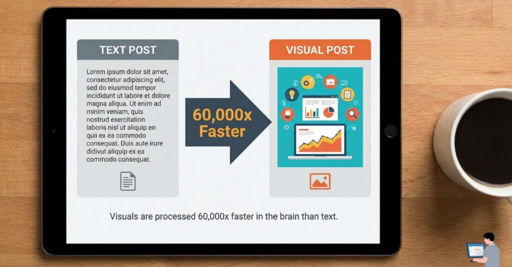
Table of Contents
Part 1: The “Secret Step” (Do This Before You Design)
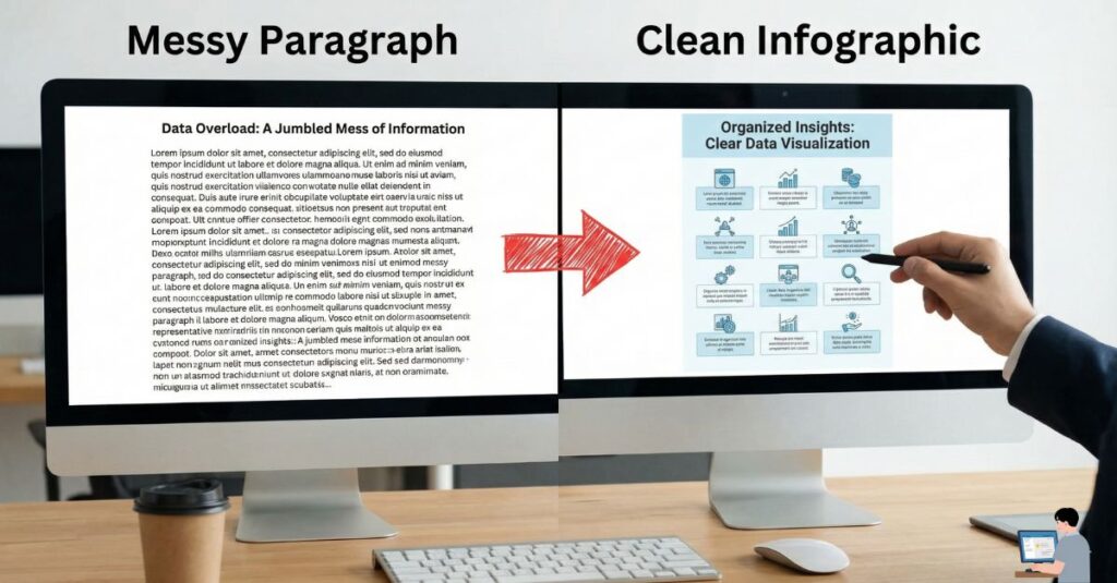
Most people fail with AI infographics because they make one huge mistake: they paste a generic blog post into a design tool and expect art.
AI needs structure, not noise. If you feed it a messy paragraph, you will get a cluttered design. Before you open any design software, you must organize your text into a “Visual Structure.”
The “Visual Architect” Prompt
Use the prompt below to turn your raw thoughts into a structured blueprint.
Copy & Paste this into ChatGPT or Claude:
“Act as a Senior Visual Data Analyst. I want to create a viral infographic about: [Insert Topic, e.g., Remote Work Productivity].
Please take the text below and structure it into 5 distinct ‘Visual Cards.’ For each card, provide:
- A short, punchy headline (max 6 words).
- The core data point or fact (keep it under 20 words).
- A suggestion for the icon/visual to use (e.g., ‘Warning Sign’ or ‘Upward Graph’).
[Paste your raw text here]”
Once the chatbot gives you this structured output, you are ready to open the design tools.
Part 2: The Best AI Tools for Infographics (2026 Review)
I have tested dozens of tools, and most of them just generate “AI Art” (which is useless for accurate data). You need Diagram-Aware AI.
Here are the only 3 tools you actually need:
1. Napkin.ai (Best for Concepts & Docs)
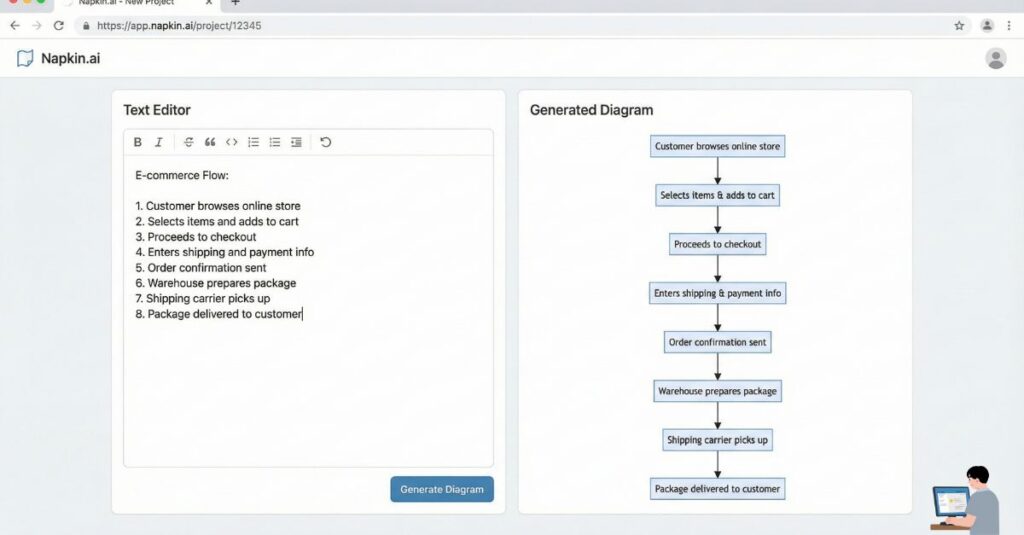
- Best For: LinkedIn posts, Explaining complex ideas, Flowcharts.
Napkin.ai is a game-changer because it integrates directly with your writing workflow. You simply highlight your text in a doc, click a button, and it generates a diagram instantly. It is perfect for turning a boring paragraph into a professional flowchart or process map.
- My Verdict: Use this if you are a writer who wants visuals but hates complex design software.
- [Insert Screenshot 1 Here: Napkin.ai interface turning text into a diagram]
2. Piktochart AI (Best for Tall Infographics)
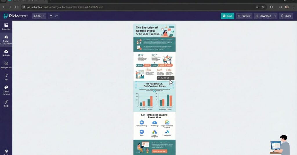
- Best For: Pinterest Pins, Blog Summaries, “How-To” Guides.
If you need those long, vertical infographics popular on Pinterest, Piktochart is the king. Their AI understands “Storytelling.” You give it a topic like “The History of Bitcoin,” and it builds a timeline with proper visual hierarchy.
- My Verdict: Essential for bloggers and SEOs who want to drive traffic from Pinterest.
3. Canva Magic Design (Best for Social Media)
- Best For: Instagram Carousels, Facebook Posts.
Canva has integrated AI into its core. You can now upload an image or type a prompt, and “Magic Design” will build a 10-slide carousel for you. It isn’t perfect, but it gets you 90% of the way there, leaving you to just tweak the colors.
- My Verdict: Great for quick social media content, though less precise for complex data than Napkin.
Part 3: Step-by-Step Workflow (Text to Viral)
Here is the exact workflow to create a high-quality infographic in under 10 minutes.
- Refine the Data: Use the “Secret Prompt” from Part 1 to clean up your text. Never skip this step.
- Choose Your Format:
- Is it a process? Use Napkin.ai.
- Is it a list? Use Piktochart.
- Is it for Instagram? Use Canva.
- The “3-Second Rule”: Look at your design. If a user cannot understand the main point in 3 seconds, delete half the text. Clutter kills virality.
- Brand It: Always add your website URL or logo at the bottom. If the image goes viral, you want the credit (and the traffic).
Part 4: Why Infographics Go Viral (The Psychology)
It is not just about pretty colors. Viral infographics follow a strict psychological structure designed to stop the scroll.
- One Idea Per Visual: Do not try to explain everything at once. One card = One idea.
- High Contrast: Use dark text on light backgrounds (or vice versa). Hard-to-read text gets scrolled past immediately.
- The “Hook” Headline: Your title shouldn’t be boring like “Remote Work Stats.” It should trigger emotion, like “Why Remote Work is Failing (New Data).” Emotion drives clicks.
FAQ: Common Questions
Q: Can ChatGPT make infographics by itself? A: No. ChatGPT can generate code for charts (using Python) or the text for infographics, but it cannot export a high-resolution .PNG image file that looks good. You must pair ChatGPT with a design tool like Napkin or Canva.
Q: What is the best free AI infographic generator? A: Canva’s free plan is the most robust. You can access “Magic Design” features with some limits. Napkin.ai is also currently free during its beta phase (as of 2026), making it a great option to try right now.
Q: Do I need to be a designer? A: Absolutely not. The AI handles alignment, color theory, and spacing. Your job is no longer designing—it is simply curating the information.
Final Verdict
The era of hiring expensive graphic designers for simple social media posts is over.
Your job is no longer to push pixels—it is to decide what is worth visualizing. Stop publishing walls of text that no one reads. Use the prompt in Part 1, pick a tool from Part 2, and let the internet do the sharing.